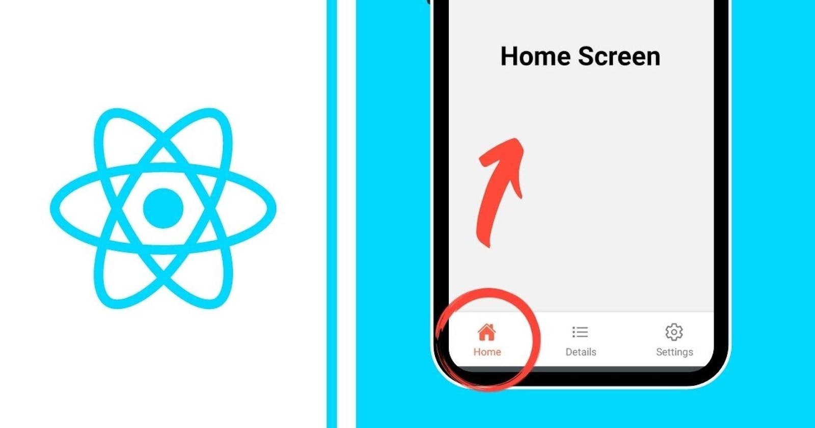
Documentation
https://reactnavigation.org/docs/bottom-tab-navigator
import {createBottomTabNavigator} from '@react-navigation/bottom-tabs';
import {NavigationContainer} from '@react-navigation/native';
import PlacesScreen from './screens/PlacesScreen';
import AnimalScreen from './screens/AnimalScreen';
import Feather from 'react-native-vector-icons/Feather';
import MaterialIcons from 'react-native-vector-icons/MaterialIcons';
import FontAwesome from 'react-native-vector-icons/FontAwesome';
import {AboutStack} from './AppStack';
const Tab = createBottomTabNavigator();

export default function App() {
  return (
    <NavigationContainer>
      <Tab.Navigator
        screenOptions={{
          tabBarLabelPosition: 'below-icon',
          tabBarShowLabel: true,
          tabBarActiveTintColor: 'blue',
          tabBarInactiveTintColor: 'black',
        }}>
        <Tab.Screen
          name="Animal"
          component={AnimalScreen}
          options={{
            tabBarIcon: ({color}) => (
              <Feather name="info" color={color} size={22} />
            ),
            headerStyle: {backgroundColor: 'green'},
            headerTintColor: 'white',
            headerTitleStyle: {
              fontWeight: 'bold',
              fontSize: 20,
            },
            headerTitleAlign: 'center',
          }}
        />
        <Tab.Screen
          name="Places"
          component={PlacesScreen}
          options={{
            tabBarLabel: 'Travel',
            tabBarIcon: ({color}) => (
              <MaterialIcons name="travel-explore" color={color} size={22} />
            ),
            headerStyle: {backgroundColor: 'yellow'},
            headerTintColor: 'black',
            headerTitleStyle: {
              fontWeight: 'bold',
              fontSize: 20,
            },
            headerTitleAlign: 'center',
          }}
        />

        <Tab.Screen
          name="Stacks"
          component={AboutStack}
          options={{
            headerShown: false,
            tabBarIcon: ({color}) => (
              <FontAwesome name="stack-exchange" color={color} size={22} />
            ),
          }}
        />
      </Tab.Navigator>
    </NavigationContainer>
  );
}
The React Native code snippet you've provided defines a simple mobile application using the react-navigation library to implement bottom tab navigation. Here's a brief explanation of its components and functionalities:
Components
- Tab Navigation: The app uses
createBottomTabNavigatorfromreact-navigation/bottom-tabsto create a bottom tab navigator which allows the user to switch between different screens by tapping on the tabs at the bottom of the screen.
Key Features
Three Tabs: The navigator has three tabs:
Animal: Displays the
AnimalScreen. The tab icon is set usingFeathericons library. It shows an info icon.Places: Shows the
PlacesScreenbut the tab is labeled as "Travel". The icon here is a travel icon from theMaterialIconslibrary.Stacks: Renders the
AboutStackwhich seems to be a stack navigator (judging from the name and the usage). This tab uses an icon from theFontAwesomelibrary that represents a stack.
Navigation Styling and Options
Tab Bar Customization: Each tab has specific options like:
tabBarLabelPosition: Labels are shown below the icon.tabBarActiveTintColorandtabBarInactiveTintColor: Colors for the tab icons and text when they are active or inactive.
Screen Options: Each screen/tab can have its own navigation options such as
headerStyle,headerTintColor,headerTitleStyle, andheaderTitleAlignwhich customize the appearance and alignment of the header on each screen.
Usage of Icons
- Icons are integrated into the tab bar for visual guidance, using different icon libraries like
Feather,MaterialIcons, andFontAwesome.
This setup makes the application user-friendly by providing easy navigation through tabs, each distinguished by unique icons and styles, facilitating a better user experience in accessing different parts of the app.


