

MyKeyboard.tsx
import * as React from "react";
import Button from "./Button";
import { View, Text } from "react-native";
import { Styles } from "../styles/GlobalStyles";
import { myColors } from "../styles/Colors";

export default function MyKeyboard() {
  const [firstNumber, setFirstNumber] = React.useState("");
  const [secondNumber, setSecondNumber] = React.useState("");
  const [operation, setOperation] = React.useState("");
  const [result, setResult] = React.useState<Number | null>(null);

  const handleNumberPress = (buttonValue: string) => {
    if (firstNumber.length < 10) {
      setFirstNumber(firstNumber + buttonValue);
    }
  };

  const handleOperationPress = (buttonValue: string) => {
    setOperation(buttonValue);
    setSecondNumber(firstNumber);
    setFirstNumber("");
  };

  const clear = () => {
    setFirstNumber("");
    setSecondNumber("");
    setOperation("");
    setResult(null);
  };

  const getResult = () => {
    let tempResult;
    switch (operation) {
      case "+":
        tempResult = parseFloat(secondNumber) + parseFloat(firstNumber);
        break;
      case "-":
        tempResult = parseFloat(secondNumber) - parseFloat(firstNumber);
        break;
      case "*":
        tempResult = parseFloat(secondNumber) * parseFloat(firstNumber);
        break;
      case "/":
        tempResult = parseFloat(secondNumber) / parseFloat(firstNumber);
        break;
      default:
        tempResult = 0;
        break;
    }
    clear();
    setResult(tempResult);
  };

  const firstNumberDisplay = () => {
    // Ensure `result` is treated as a primitive number
    const resultValue = Number(result); // Convert to primitive number if necessary

    if (result !== null) {
      return (
        <Text
          style={
            resultValue < 9999
              ? [Styles.screenFirstNumber, { color: myColors.result }]
              : [
                  Styles.screenFirstNumber,
                  { fontSize: 50, color: myColors.result },
                ]
          }
        >
          {resultValue.toString()}
        </Text>
      );
    }
    if (firstNumber && firstNumber.length < 6) {
      return <Text style={Styles.screenFirstNumber}>{firstNumber}</Text>;
    }
    if (firstNumber === "") {
      return <Text style={Styles.screenFirstNumber}>{"0"}</Text>;
    }
    if (firstNumber.length > 5 && firstNumber.length < 8) {
      return (
        <Text style={[Styles.screenFirstNumber, { fontSize: 70 }]}>
          {firstNumber}
        </Text>
      );
    }
    if (firstNumber.length > 7) {
      return (
        <Text style={[Styles.screenFirstNumber, { fontSize: 50 }]}>
          {firstNumber}
        </Text>
      );
    }
  };

  return (
    <View style={Styles.viewButton}>
      <View
        style={{
          height: 120,
          width: "90%",
          justifyContent: "flex-end",
          alignItems: "center",
        }}
      >
        <Text style={Styles.screenSecondNumber}>
          {secondNumber}
          <Text style={{ color: "purple", fontSize: 50, fontWeight: "500" }}>
            {operation}
          </Text>
        </Text>
        {firstNumberDisplay()}
      </View>
      <View style={Styles.row}>
        <Button title="C" onPress={clear} isGray={true} isBlue={false} />
        <Button
          title="+/-"
          onPress={() => handleOperationPress("+/-")}
          isGray={true}
          isBlue={false}
        />
        <Button
          title="%"
          onPress={() => handleOperationPress("%")}
          isGray={true}
          isBlue={false}
        />
        <Button
          title="/"
          onPress={() => handleOperationPress("/")}
          isBlue={true}
          isGray={false}
        />
      </View>
      <View style={Styles.row}>
        <Button
          title="7"
          onPress={() => handleNumberPress("7")}
          isGray={false}
          isBlue={false}
        />
        <Button
          title="8"
          onPress={() => handleNumberPress("8")}
          isGray={false}
          isBlue={false}
        />
        <Button
          title="9"
          onPress={() => handleNumberPress("9")}
          isGray={false}
          isBlue={false}
        />
        <Button
          title="*"
          onPress={() => handleOperationPress("*")}
          isBlue={true}
          isGray={false}
        />
      </View>
      <View style={Styles.row}>
        <Button
          title="4"
          onPress={() => handleNumberPress("4")}
          isGray={false}
          isBlue={false}
        />
        <Button
          title="5"
          onPress={() => handleNumberPress("5")}
          isGray={false}
          isBlue={false}
        />
        <Button
          title="6"
          onPress={() => handleNumberPress("6")}
          isGray={false}
          isBlue={false}
        />
        <Button
          title="-"
          onPress={() => handleOperationPress("-")}
          isBlue={true}
          isGray={false}
        />
      </View>
      <View style={Styles.row}>
        <Button
          title="1"
          onPress={() => handleNumberPress("1")}
          isGray={false}
          isBlue={false}
        />
        <Button
          title="2"
          onPress={() => handleNumberPress("2")}
          isGray={false}
          isBlue={false}
        />
        <Button
          title="3"
          onPress={() => handleNumberPress("3")}
          isGray={false}
          isBlue={false}
        />
        <Button
          title="+"
          onPress={() => handleOperationPress("+")}
          isBlue={true}
          isGray={false}
        />
      </View>
      <View style={Styles.row}>
        <Button
          title="0"
          onPress={() => handleNumberPress("0")}
          isGray={false}
          isBlue={false}
        />
        <Button
          title="."
          onPress={() => handleNumberPress(".")}
          isGray={false}
          isBlue={false}
        />
        <Button
          title="⌫"
          onPress={() => setFirstNumber(firstNumber.slice(0, -1))}
          isGray={true}
          isBlue={false}
        />
        <Button
          title="="
          onPress={() => getResult()}
          isBlue={true}
          isGray={false}
        />
      </View>
    </View>
  );
}
The provided React code defines a functional component called MyKeyboard, which represents a simple calculator app built with React Native. This component handles basic arithmetic operations like addition, subtraction, multiplication, and division. Here’s a simplified explanation of its main functionalities:
State Management:
firstNumber,secondNumber,operation,result: These state variables store the current numbers entered by the user, the operation selected, and the calculation result, respectively.
Functions:
handleNumberPress: This function appends the digit pressed to the currentfirstNumberif it has less than 10 digits.handleOperationPress: Sets the current operation and moves thefirstNumbertosecondNumberto prepare for the next input. It resetsfirstNumberto empty, awaiting new input.clear: Resets all state variables to their initial states, effectively clearing the calculator.getResult: Performs the calculation based on the operation and numbers entered, then callsclearto reset input fields while storing the result for display.firstNumberDisplay: Dynamically generates text components to display the currentfirstNumberor result, with styling adjustments based on the length of the number to ensure it fits well on the display.
Component Structure:
Views and Text: The layout is structured with views containing text components to display the calculator's screen and results dynamically.
Buttons: Uses a custom
Buttoncomponent for each calculator button, which handles various interactions like entering numbers, operations, and clearing the result. These buttons are styled conditionally based on the propsisBlueandisGrayto differentiate functions like operation or utility buttons.
Styling:
- Styles are managed through
Styles, which likely contains predefined styles for buttons and text to ensure consistent and appealing visuals.
Summary:
MyKeyboard acts as a self-contained calculator, allowing users to perform basic arithmetic tasks. It manages user input, displays results interactively, and maintains a clear interface for operations. The use of React state and conditional rendering helps in keeping the UI responsive and the calculations accurate as per user interactions.
Button.tsx
import { useContext } from "react";
import { TouchableOpacity, Text } from "react-native";
import { ThemeContext } from "../context/ThemeContext";
import { Styles } from "../styles/GlobalStyles";

interface ButtonProps {
  onPress: () => void;
  title: string;
  isBlue: boolean;
  isGray: boolean;
}

export default function Button({
  title,
  onPress,
  isBlue,
  isGray,
}: ButtonProps) {
  const { theme } = useContext(ThemeContext); // Assuming ThemeContext provides an object with a 'theme' property

  const getButtonStyle = () => {
    if (isBlue) {
      return Styles.btnBlue;
    }
    if (isGray) {
      return Styles.btnGray;
    }
    return theme === "light" ? Styles.btnLight : Styles.btnGray; // Assuming Styles.btnDark is defined
  };

  const getTextStyle = () => {
    if (isBlue || isGray) {
      return Styles.smallTextLight;
    }
    return theme === "dark" ? Styles.smallTextLight : Styles.smallTextDark;
  };

  return (
    <TouchableOpacity style={getButtonStyle()} onPress={onPress}>
      <Text style={getTextStyle()}>{title}</Text>
    </TouchableOpacity>
  );
}
Sure, I'll simplify the explanation of your React Native Button component:
Overview
The Button component is designed to create a customizable button in a React Native application. It uses context to adapt its appearance based on the current theme (like dark or light mode), and props to modify its style based on the button type (blue or gray).
Key Components
ThemeContext: This is used to access the current theme setting of the app, which affects the button's background and text color.onPress: A function prop that defines what should happen when the user taps the button.title: Text displayed on the button.isBlueandisGray: Boolean props that determine the button’s color scheme.
Functions
getButtonStyle: Determines the background style of the button. IfisBlueis true, the button gets a blue style; ifisGrayis true, it gets a gray style; otherwise, it adjusts style based on the theme.getTextStyle: Decides the color of the text inside the button, again based on the button type and theme.
Rendering
The button uses
TouchableOpacityfor touch interaction, styled dynamically based on thegetButtonStylefunction.It displays a text label styled by the
getTextStylefunction, which shows the button's title.
This setup allows the button to look consistent with the overall app's theme while also providing specific styling for different types of buttons.
GlobalStyle.tsx
import { StyleSheet } from "react-native";
import { myColors } from "./Colors";

export const Styles = StyleSheet.create({
  //Button
  btnBlue: {
    width: 72,
    height: 72,
    borderRadius: 24,
    backgroundColor: myColors.blue,
    justifyContent: "center",
    alignItems: "center",
    margin: 8,
  },
  btnDark: {
    width: 72,
    height: 72,
    borderRadius: 24,
    backgroundColor: myColors.black,
    justifyContent: "center",
    alignItems: "center",
    margin: 8,
  },
  btnLight: {
    width: 72,
    height: 72,
    borderRadius: 24,
    backgroundColor: myColors.white,
    justifyContent: "center",
    alignItems: "center",
    margin: 8,
  },

  btnGray: {
    width: 72,
    height: 72,
    borderRadius: 24,
    backgroundColor: myColors.btnGray,
    justifyContent: "center",
    alignItems: "center",
    margin: 8,
  },
  smallTextLight: {
    fontSize: 32,
    color: myColors.white,
  },
  smallTextDark: {
    fontSize: 32,
    color: myColors.black,
  },
  //keyboard
  row: {
    maxWidth: "100%",
    flexDirection: "row",
  },
  viewButton: {
    position: "absolute",
    bottom: 0,
  },
  screenFirstNumber: {
    fontSize: 96,
    color: myColors.gray,
    fontWeight: "200",
    alignSelf: "flex-end",
  },
  screenSecondNumber: {
    fontSize: 40,
    color: myColors.gray,
    fontWeight: "200",
    alignSelf: "flex-end",
  },
});
ThemeContext.tsx
import { createContext } from "react";

export const ThemeContext = createContext("light");
color.tsx
export const myColors = {
  light: "#F1F2F3",
  dark: "#17171C",
  blue: "#4B5EFC",
  btnGray: "#4E505F",
  btnDark: "#2E2F38",
  gray: "#747477",
  black: "#000000",
  white: "white",
  result: "#46D5B2",
};
App.js
import { useState, useContext } from "react";
import { StatusBar } from "expo-status-bar";
import { StyleSheet, Text, View, Switch, SafeAreaView } from "react-native";
import { ThemeContext } from "./src/context/ThemeContext";
import { myColors } from "./src/styles/Colors";
import Button from "./src/components/Button";
import MyKeyboard from "./src/components/MyKeyboard";

export default function App() {
  const [theme, setTheme] = useState("light");

  return (
    <ThemeContext.Provider value={{ theme }}>
      <SafeAreaView
        style={
          theme === "light"
            ? styles.container
            : [styles.container, { backgroundColor: myColors.dark || "#000" }]
        }
      >
        <StatusBar
          style={theme === "light" ? "dark-content" : "light-content"}
        />
        <Switch
          value={theme === "light"}
          onValueChange={() => setTheme(theme === "light" ? "dark" : "light")}
          style={styles.Switch}
        />
        <MyKeyboard />
      </SafeAreaView>
    </ThemeContext.Provider>
  );
}

const styles = StyleSheet.create({
  container: {
    flex: 1,
    backgroundColor: myColors.light, // Ensure myColors.light is defined
    alignItems: "center",
    justifyContent: "flex-start",
  },
  Switch: {
    marginVertical: 20,
  },
});
This React Native application sets up a basic theme-switching functionality using context and includes a custom keyboard component for user interaction.
Key Components
ThemeContext: Provides the theme state (
lightordark) to other components in the app. This context is utilized to dynamically alter the styles based on the current theme.SafeAreaView: Ensures that the UI does not overlap with system components like the status bar or the notch on iPhones. It adjusts its background color based on the selected theme.
StatusBar: Adapts its content color dynamically to improve visibility depending on the theme. For instance, it uses dark text on light backgrounds and light text on dark backgrounds.
Switch: Allows the user to toggle between light and dark themes. It changes the theme state when toggled, which triggers a re-render with the new theme settings.
MyKeyboard: A custom component that probably serves as a numeric or functional keyboard for user input. The behavior and style of this component may also respond to theme changes.
Functionality
useState: Manages the theme state locally within the app. Initially set to "light", the state can be toggled to "dark" using the switch.
ThemeContext.Provider: Wraps the app's components to provide the current theme value. This context is likely consumed in other components (like
MyKeyboard) to adjust their styling accordingly.
Styling
- The
styles.containeradjusts the background color of the app based on the current theme, using predefined colors frommyColors.
Interaction
- The app uses a toggle switch to let the user switch between a light and dark theme. Changing this switch updates the theme state, which in turn updates the context and triggers a re-render of the app with the new theme applied.
This setup provides a fundamental example of theme management in a React Native app, demonstrating context usage, state management, and conditional styling based on user interactions.

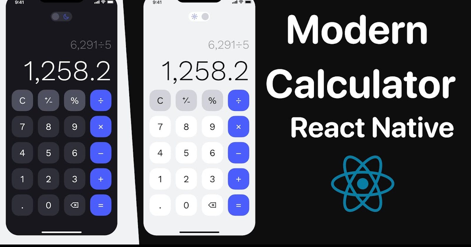
Both Dark And Light Mode available by clicking the top switch

Its a very Basic Calculator

The answer comes in Green color.