

Actioncard.tsx

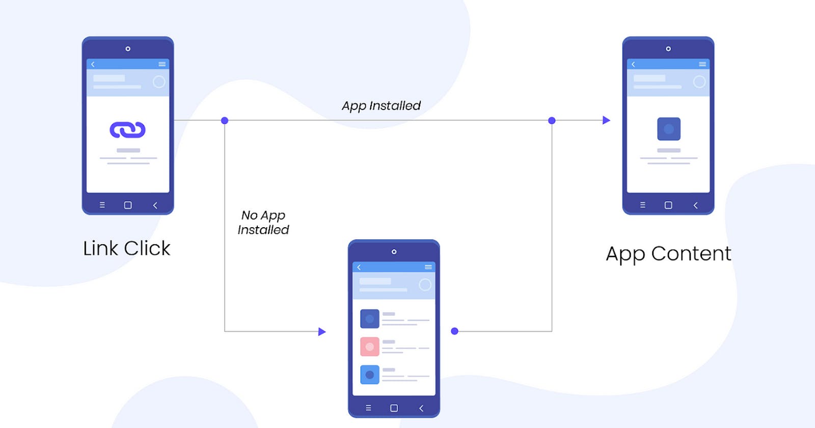
Here Read More and Follow me have given a link which open in chrome in android.

import {
  Image,
  Linking,
  StyleSheet,
  Text,
  View,
  TouchableOpacity,
} from 'react-native';
import React from 'react';

export default function Actioncard() {
  function openWebsite(websiteLink: string) {
    Linking.openURL(websiteLink);
  }
  return (
    <View>
      <Text style={styles.headingText}>Blog Card</Text>
      <View style={[styles.card, styles.elevatedCard]}>
        <View style={styles.headingContainer}>
          <Text style={styles.headerText}>Linking in React-Native</Text>
        </View>
        <Image
          source={{uri: 'https://i.ytimg.com/vi/bR3ZUTfHDKw/maxresdefault.jpg'}}
          style={styles.cardIamge}
        />
        <View style={styles.bodyContainer}>
          <Text numberOfLines={3} style={styles.bodyText}>
            Linking gives you a general interface to interact with both incoming
            and outgoing app links. Every Link (URL) has a URL Scheme, some
            websites are prefixed with https:// or http:// and the http is the
            URL Scheme. Let's call it scheme for short. In addition to https,
            you're likely also familiar with the mailto scheme. When you open a
            link with the mailto scheme, your operating system will open an
            installed mail application. Similarly, there are schemes for making
            phone calls and sending SMS. Read more about built-in URL schemes
            below.
          </Text>
        </View>
        <View style={styles.footerConatiner}>
          <TouchableOpacity
            onPress={() =>
              openWebsite('https://reactnative.dev/docs/linking#openurl')
            }>
            <Text style={styles.footerText}>Read More</Text>
          </TouchableOpacity>
          <TouchableOpacity
            onPress={() => openWebsite('https://kisanms.hashnode.dev/')}>
            <Text style={styles.footerText}>Follow Me</Text>
          </TouchableOpacity>
        </View>
      </View>
    </View>
  );
}

const styles = StyleSheet.create({
  headingText: {
    fontSize: 20,
    fontWeight: 'bold',
    color: 'black',
    textAlign: 'center',
    padding: 10,
    backgroundColor: 'white',
  },
  card: {
    width: 360,
    height: 350,
    borderRadius: 6,
    marginVertical: 12,
    marginHorizontal: 17,
  },
  elevatedCard: {
    backgroundColor: 'black',
    elevation: 3,
    shadowOffset: {
      width: 1,
      height: 1,
    },
  },
  headingContainer: {
    height: 40,
    flexDirection: 'row',
    justifyContent: 'center',
    alignItems: 'center',
  },
  headerText: {
    color: 'white',
    fontSize: 20,
    fontWeight: 'bold',
    textAlign: 'center',
    backgroundColor: 'black',
  },
  cardIamge: {
    height: 200,
    width: 'auto',
  },
  bodyContainer: {
    padding: 10,
  },
  bodyText: {
    color: 'white',
    fontSize: 15,
    textAlign: 'justify',
  },
  footerConatiner: {
    padding: 6,
    flexDirection: 'row',
    justifyContent: 'space-between',
    alignItems: 'center',
  },
  footerText: {
    color: 'black',
    backgroundColor: 'white',
    paddingHorizontal: 20,
    paddingVertical: 3,
    borderRadius: 6,
    fontWeight: 'bold',
    fontSize: 15,
  },
});
This React Native code defines a component called Actioncard that displays a styled card with content about the Linking API in React Native. Here's a breakdown of the code:
Imports and Setup:
The code imports necessary components from
react-nativesuch asImage,Linking,Text,View,TouchableOpacity, andStyleSheet.Linkingis used to handle opening URLs in the device's default browser.
Component Function - Actioncard:
The component defines a function
openWebsitewhich takes a URL (websiteLink) and uses theLinking.openURLmethod to open it.The
Actioncardcomponent returns aViewcontaining a text header ("Blog Card") and a main card view that includes:A header section with the text "Linking in React-Native".
An image displayed using the
Imagecomponent.A body section containing a brief description of what the Linking API does, with a 'Read more' prompt that's truncated to three lines.
A footer containing two buttons: "Read More" and "Follow Me". These buttons are implemented using
TouchableOpacityfor better user interaction. Each button triggers theopenWebsitefunction with different URLs when pressed.
Styling:
styles: AStyleSheetis defined to style the various components:headingText: Styles for the "Blog Card" heading.card: General styles for the card including dimensions and border radius.elevatedCard: Adds background color and shadow to make the card stand out.headerText,bodyText, andfooterText: Specific styles for text elements including color, size, and layout.cardImage: Style for the image making it stretch across the card width.footerContainer: Styles for the layout of the footer section, including spacing and alignment.
Functionality:
- The
TouchableOpacitycomponents in the footer make the text clickable, enhancing interactivity and providing users with the ability to visit related links directly from the app.
- The
In summary, the Actioncard component is a visually structured and interactive card that provides an engaging way to learn about and explore more on the Linking API in React Native, showcasing how to integrate basic web navigation within a mobile application.
#linkingInReact-Native React Native Hitesh Choudhary